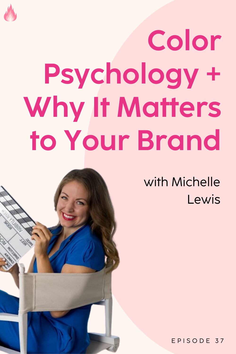
Color Psychology and Why It Matters to Your Brand

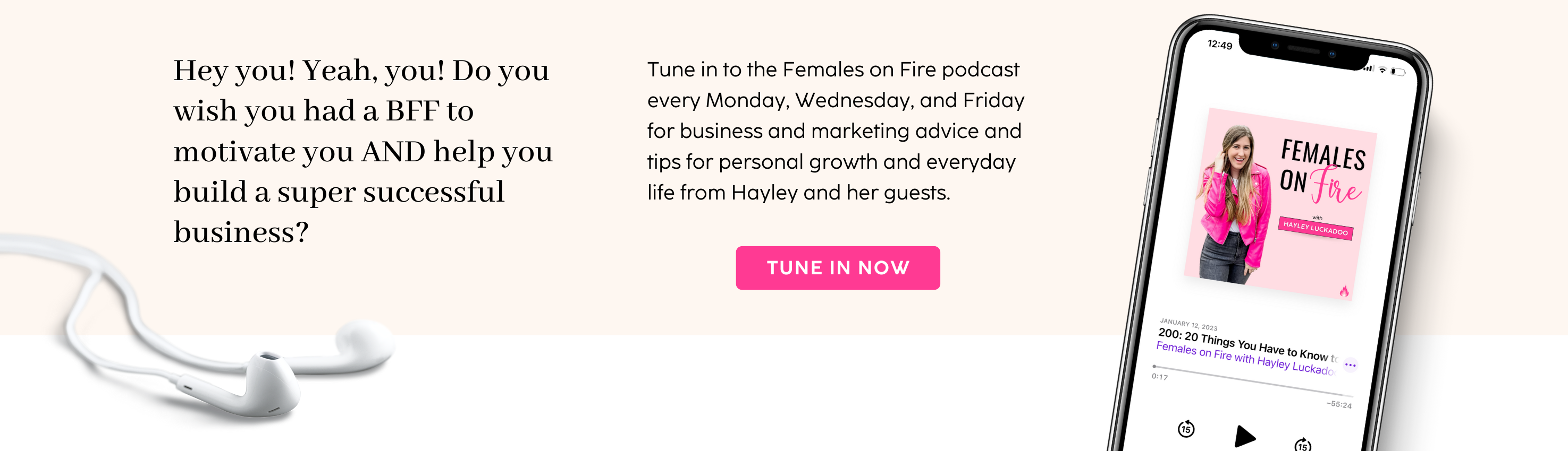
TUNE IN ANYWHERE YOU LISTEN TO PODCASTS
Michelle Lewis on The Basics of Color Psychology in Business
Did you know that there’s more to your brand colors than just whether or not you like them? Visibility coach and TedX speaker Michelle Lewis combined her background in film psychology with her study of how color affects our bodies and applied it to branding your business. She created her brand The Color Cure to bring color psychology to the masses, but she’s giving us a few of the basics in this episode!
Check out The Color Cure
Take the Brand Color Quiz
Join the Color Marketing Class
Her Entrepreneur Journey
Michelle has a background in film and television after following her dad around on movie sets. She went to film school and worked in television for about 10 years. She ended up leaving after having a script stolen from her, and she decided to start her own business.
Michelle founded the Celebrity CEO Method and Visibility Vixen, but found herself with some health issues and had to result to more natural medicines and healing. It was during that time that she began to study the impact that certain colors have on people. She decided to apply that to branding, since she understood film psychology and what people loved to see on screen, and now loves to teach on color psychology as it applies to business.
What is color psychology and where do we start?
Color psychology is essentially how your audience sees color, but also how they actually feel color. We start with the understanding that we’ve all made our fair share of brand color mistakes. We’re typically so excited to launch that we pick a color we like without much reasoning. You might be successful and build a million dollar business off those colors, but you’ll start to see trouble when you start looking for visibility and publicity to get exposure for your business.
Branding has nothing to do with you, and everything to do with the mind of your consumer.
How do we find the right color? Is it just trial and error?
The biggest part is first figuring out who your ideal client actually is, and then be able to answer the one thing / one emotion that you want them to feel when they see your brand for the first time. That’s going to give you some huge clarity. For example, if you want your client to feel hopeful and like they could have a different future, you would want something in the yellow family.
Can you tell us what a few different colors represent?
Green: This is the one I see misused the most, because it’s a challenging color. We see it a lot in regards to health. On screen it’s seen as the split personality color. Usually if you see a character in green, it’s because there the villain. This means you need to be extra careful when choosing the shade if you’re set on using green, because it resonates more with our self-identity center.
Purple: Perfect for life coaches, because this color is all about helping your client have a strong relationship with themselves.
Gold: Gold is all about being hopeful and inspired. Much like when we think of the sun, the gold family make consumers feel happy and warm.
Blue: Mainly for motivation, because it resonates most in the heart, lungs, and mammary glands.
Orange: Represents balance.
What if we’re building a more personal business and hate the brand color that most resonates?
You can’t publish a brand color that you hate. You need to spend some time with the color to see if it’s the right one for you. Pick your top two (for example, if you want them to feel inspired but also motivated), and figure out the one that helps you hone your message the most. If you still hate the color, it’s either not the right one for you and you should go with the other choice or it may indicate that the specific part of your body that resonates with that color most needs some work and healing. A good example is if you hate orange, that resonates most with the pancreas and represents balance, so there could be some underlying health issues or stressors in your life related to that.
Should we mix color families in our branding?
Too much of any one thing can be overwhelming, so it’s great to have a secondary color to help balance that. You want that one primary color that brings the cohesive aspect when you’re creating content and looking for publicity options, but having a secondary color helps. Your primary color should be what you want them to feel when they see your brand, and your secondary color should represent how you’re going to help them along the way. Just make sure that they compliment each other.
Stay tuned for new episodes of Females on Fire every Wednesday and Friday!
Love this episode? Your feedback would mean the world to us!
Want more from Females on Fire?
Grab your ticket to the Females on Fire Conference to join us live and in person for 2 days of business and personal growth!
Join the Fire Starter Club to get exclusive trainings, resources, live networking and co-working calls, and more!
Join the Females on Fire Facebook Community to get first dibs on freebies and announcements, plus meet some other amazing ladies like yourself!
If you enjoyed today's episode, please
Text 'PODCAST' to (910) 541-9177 to be first to know about episodes and even text in your questions about the episodes!
Post a screenshot from the episode on your Instagram Stories and tag @hayleyluckadoo & @femalesonfire so we can repost you!
Leave a podcast rating/review on Apple Podcasts or Spotify.
Subscribe for new episodes every Wednesday and Friday.
Enjoy these offers from our affiliate partners:
Get 50% off Flodesk for life for beautiful email marketing
Run your online business the easy way with ThriveCart
Use code ‘FEMALESONFIRE’ to get 10% off your supplements order at GutPersonal

TOP CATEGORIES:


